4 years designing complex products, from AI-assisted tools for field operations to design systems shared by three teams. Founder of Show me., a live face-recognition SaaS for events. I turn tangled workflows into clear, fast experiences.
I like stripping away the noise until a complex problem suddenly feels obvious. Most of my process is asking "why" until everyone in the room realizes we don't need that feature anyway. Big fan of clean lines, fast feedback loops, and work that just clicks.
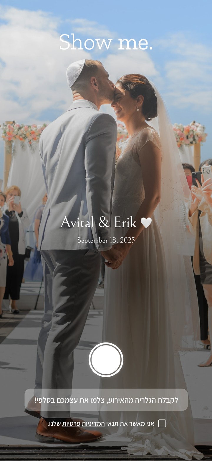
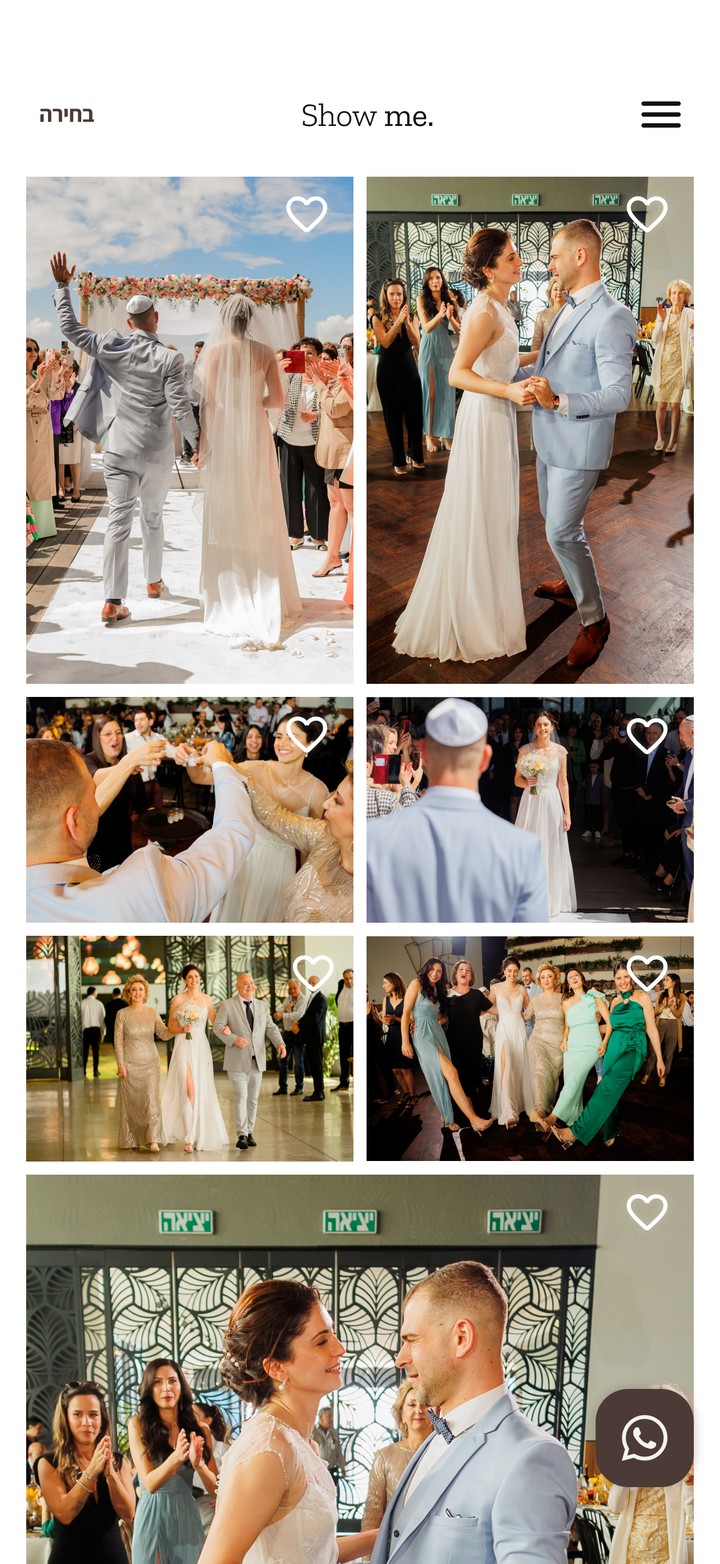
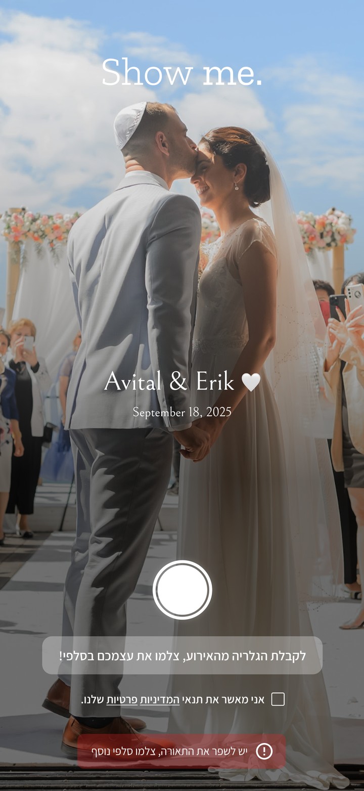
One guest selfie on the Show me. screen; face recognition picks out the event photos that guest appears in.
Problem
Thousands of photos in a Drive folder, and no way to find anyone.
After every event, the photos arrive as one Google Drive folder with thousands of images and no order at all. Hosts spend hours scrolling to find the moments they care about. Then come the guests, one message after another, asking for their photos in good quality. What should be a keepsake turns into a chore.
Constraints
Every age, every phone, zero patience for setup.
A wedding guest list runs from teenagers to grandparents. The experience had to work on any phone, from one link, without downloading an app or creating an account. Hosts aren't tech people either, and they're exhausted the day after the event. And because the product reads people's faces, privacy had to be built into every step.
Insight
Nobody wants the whole album. They want their own.
Searching by face instead of scrolling flips the whole experience. The album stops being something you dig through and becomes something that comes to you, already filtered to the moments that matter to you.
Strategy
Each step belongs to a different person.
I mapped the product around who does what, so nobody has to do more than one simple thing:
01 // HOST
Upload and send
Guest list and photographer photos go into the host's personal area.
02 // GUEST
The WhatsApp everyone waits for
A personal message with a private link. One tap, one selfie.
03 // SYSTEM
Gallery ready
Face recognition on AWS cloud matches every photo to the right person.
Market
One buyer today. Two channels next.
Today, almost all of our business comes from one buyer. The product already adapts to two more audiences, and turning them into channels is our next step.
Now
Couples
Engaged couples buying Show me. for their own wedding.
Building
Photographers
Partnerships where Show me. becomes part of the photographer's delivery.
Next
Event venues
Show me. in the venue's event package. We reach out to venues directly.
We grow through paid campaigns and organic content across social platforms. Next, we're adding to our packages, so Show me. covers the event from invitation to photos:
Seating arrangements
WhatsApp RSVPs
Pricing
Priced by the size of the event, not by features.
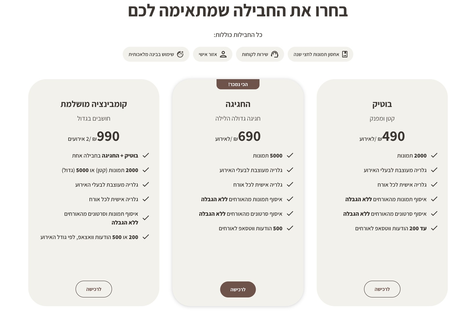
Every package includes the full experience: AI face matching, a personal designed gallery for every guest, the host's personal area, unlimited photo and video uploads from guests, six months of storage and customer support. What changes is scale, so hosts choose by guest count instead of comparing features.
Host flow
Four steps from photos to every guest's phone.
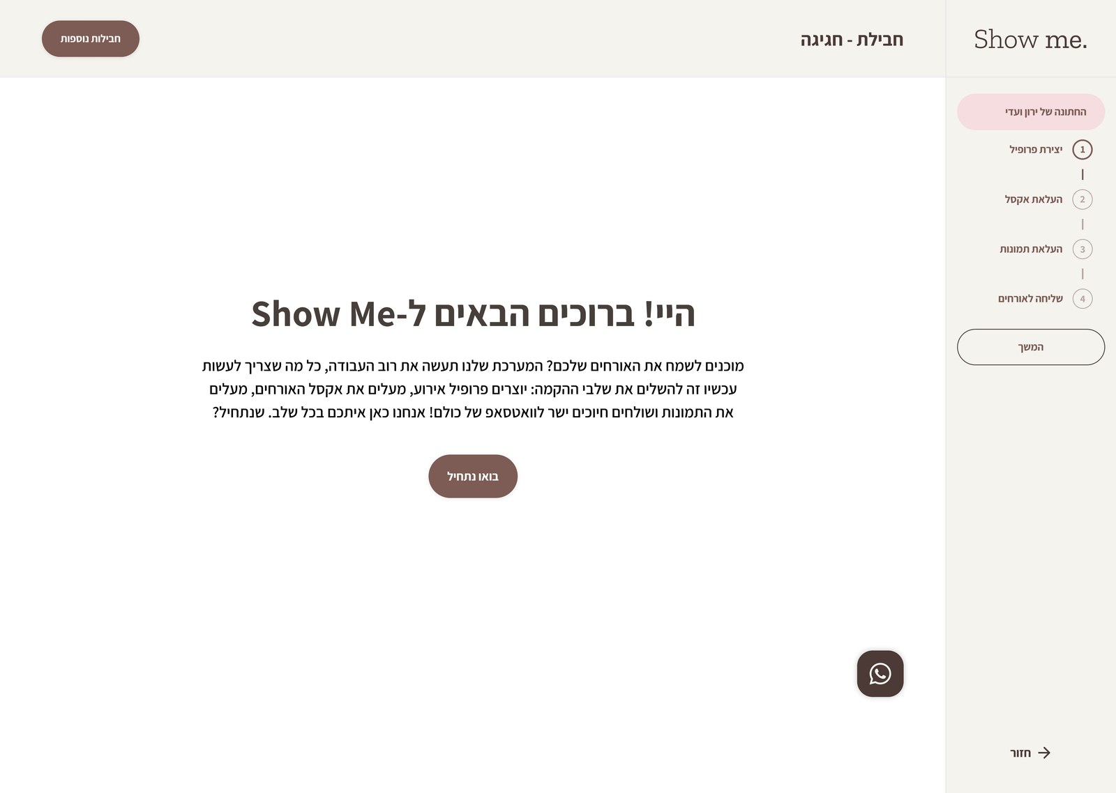
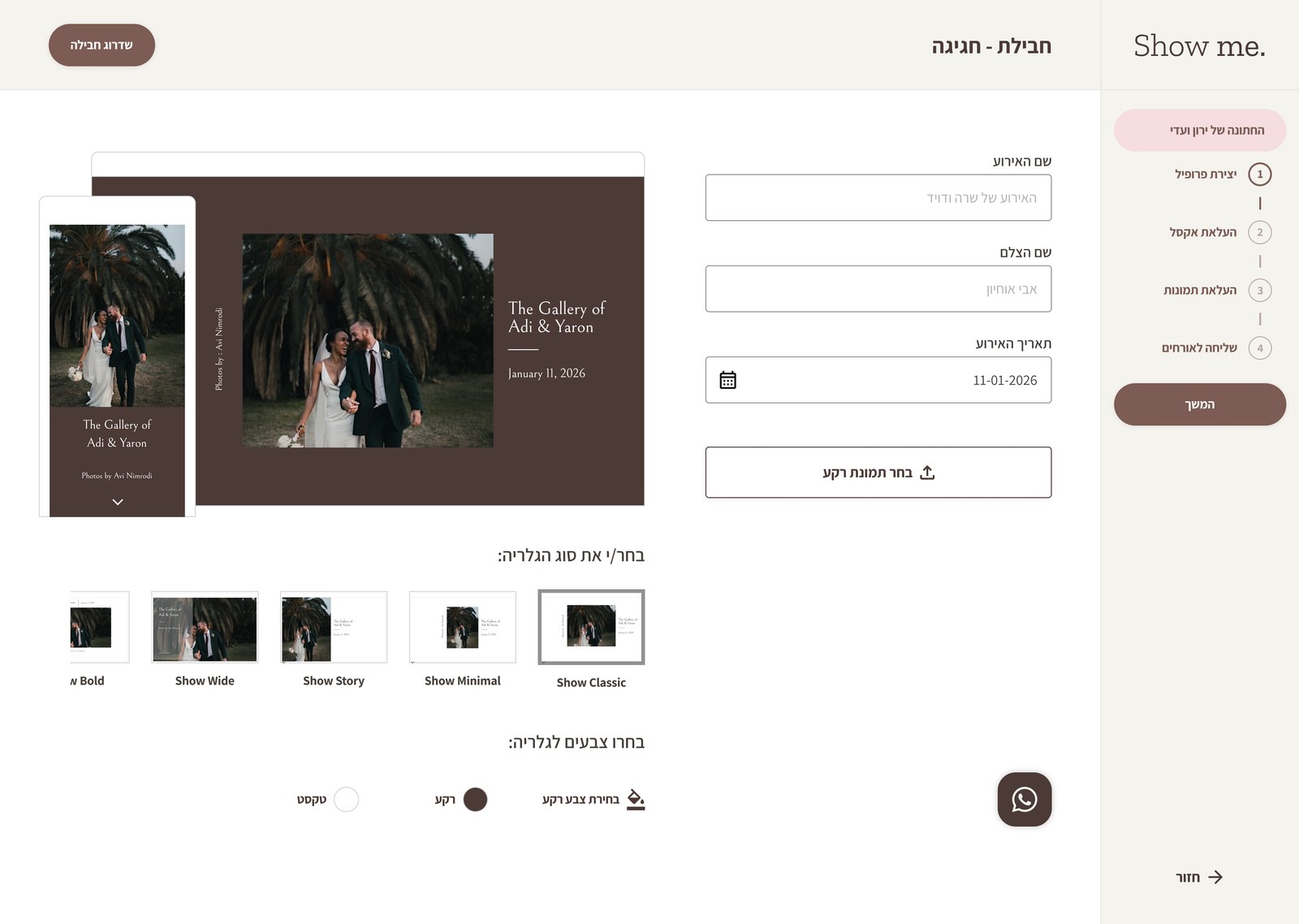
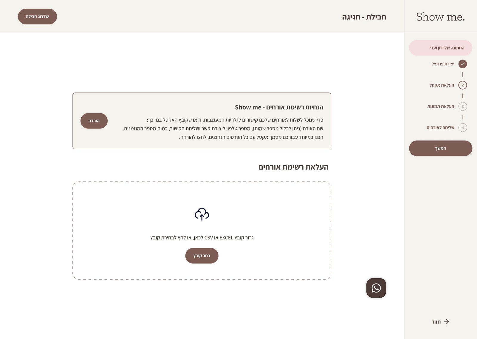
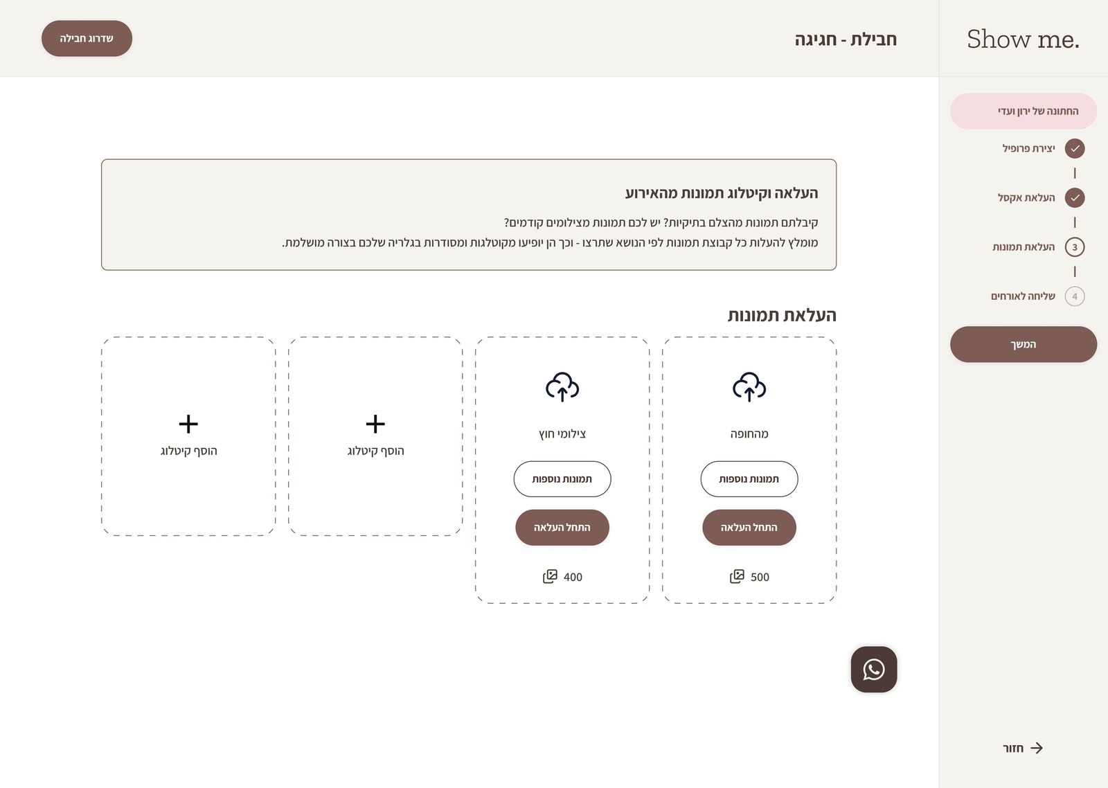
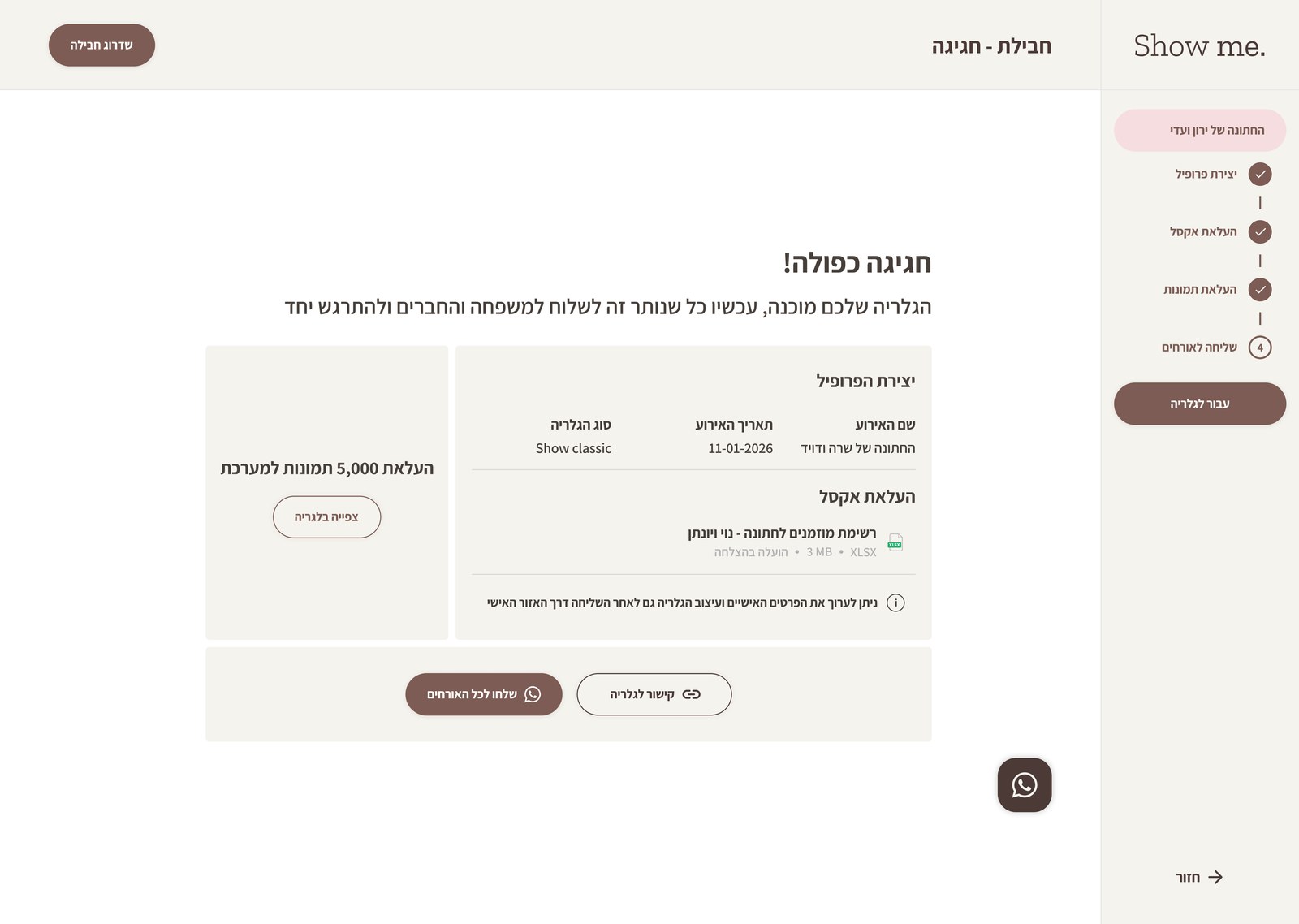
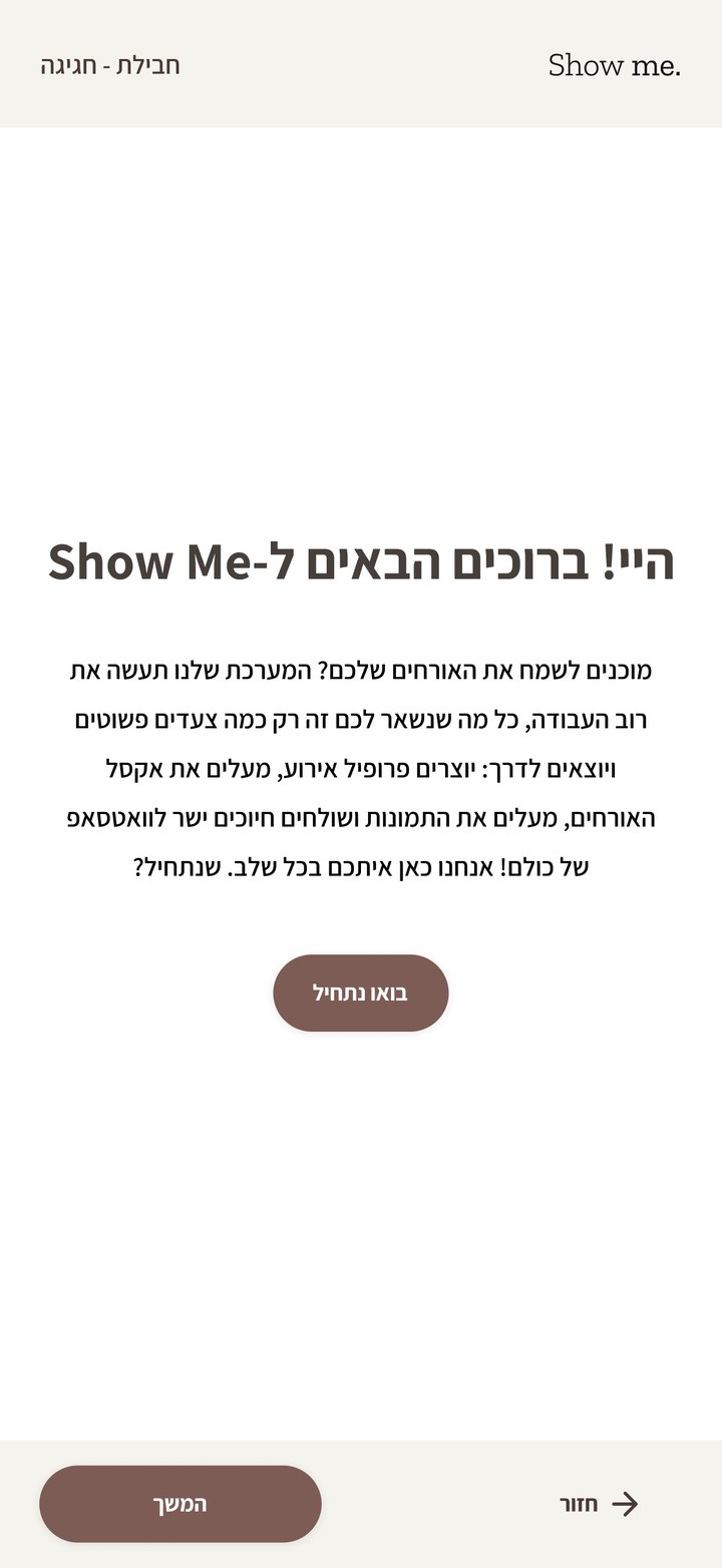
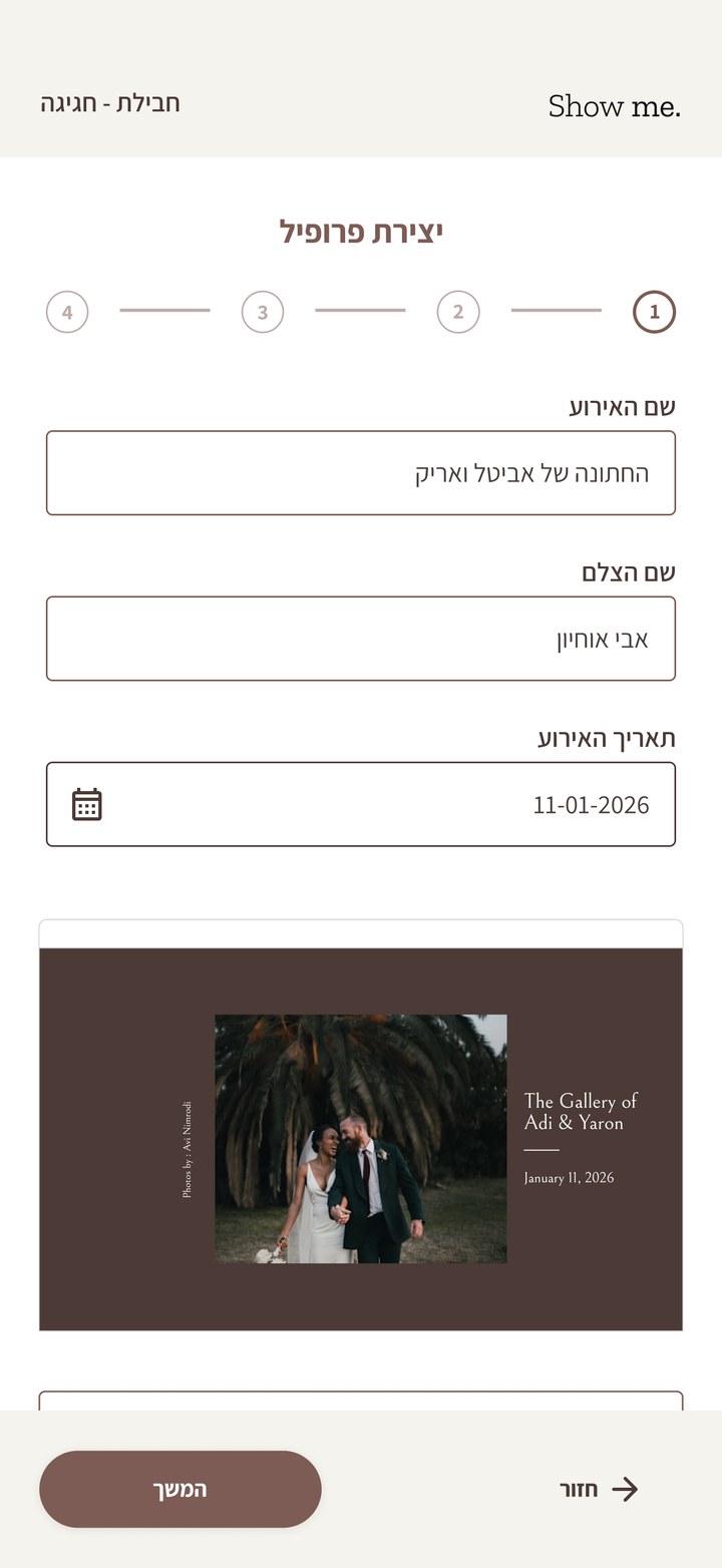
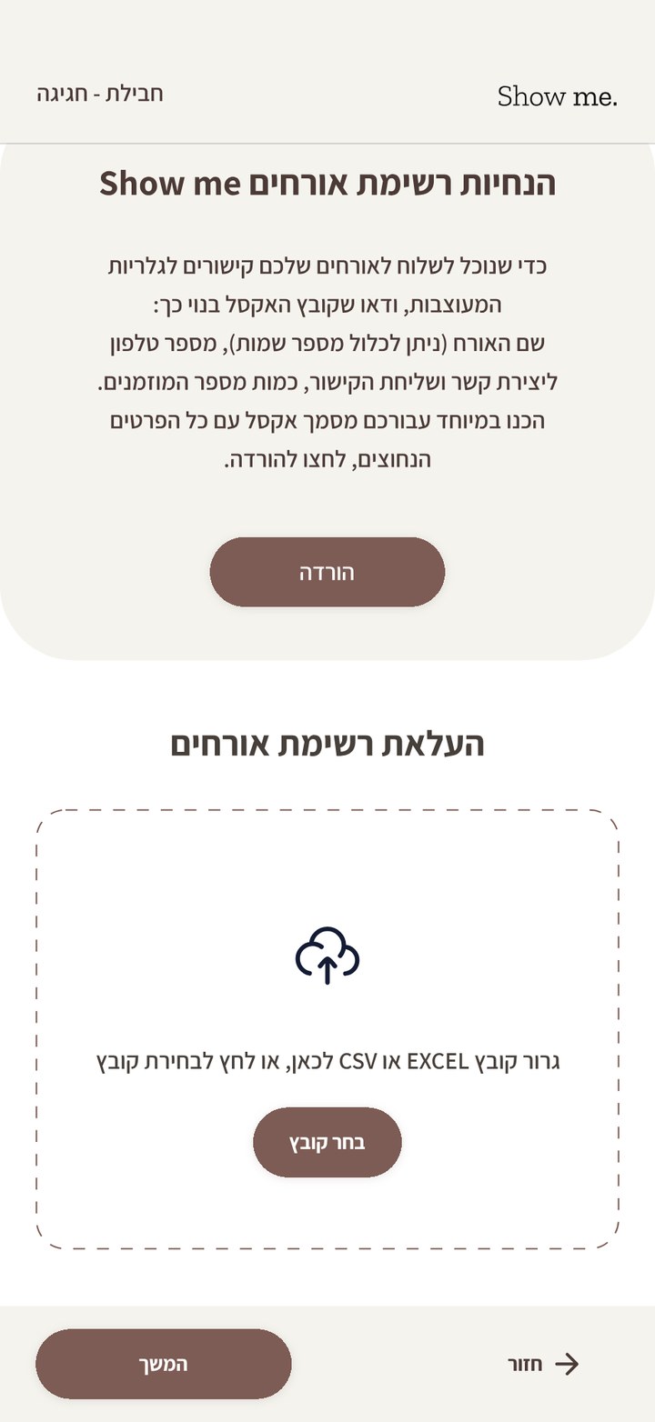
Hosts and photographers set up each event in their personal area in four steps: create the event profile, upload the guest list, upload and catalog the photos, and send. The last button sends every guest a WhatsApp message with their own personal gallery.
Uploading photos happens on desktop only. An event is thousands of photos and about half an hour of upload, too long to hold a phone open for.
On the phone: the same flow, without the photo upload
Welcome
01 Profile
02 Guest list
Guest flow
A selfie is the login.
Guests arrive from WhatsApp, the app they already trust. The link is personal, so the first screen already greets them by name. One short selfie in the browser and they're inside a gallery with every photo they appear in, within seconds.
Every guest gets VIP treatment: a gallery made for them, which leaves a sweeter memory of the night than a shared drive ever could.
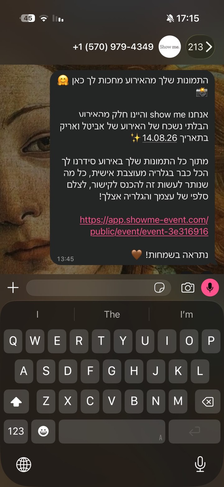
01 // THE MESSAGE
A WhatsApp message the morning after, with the event, the date and a personal link.
02 // THE SELFIE
The host's own photo and names greet the guest. They accept the privacy policy and take one selfie.
03 // THE GALLERY
Within seconds, a personal gallery of every photo they appear in, ready to save or mark as favorites.
WHEN THERE'S NO MATCH
01 // TRY AGAIN
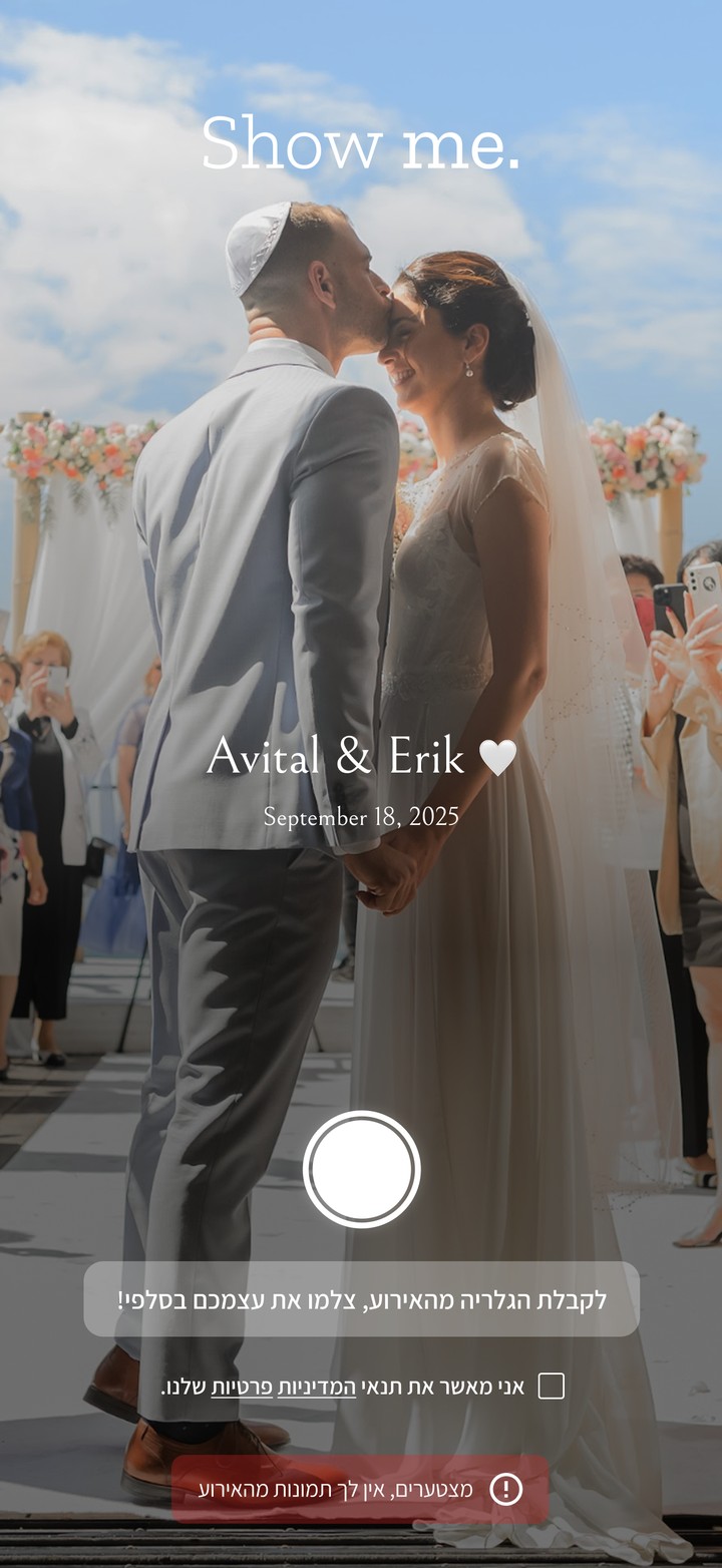
A selfie with no match usually means bad light, so the first two misses ask the guest to improve the lighting and take another one.
02 // THIRD MISS
Only if the third selfie still finds nothing does the screen say it clearly: there are no photos of you from this event.
Privacy
A face is the key, so we keep as little as possible.
Show me. runs on people's faces, so privacy was designed in from day one, together with a lawyer who drafted a detailed privacy policy for the SaaS.
Matching…
The selfie is never storedUsed once to find the guest's photos. Coming back means a new selfie, a trade-off we chose on purpose.
The host owns the photosHosts confirm they have the right to upload; faces are matched only on a guest's own request.
Anyone can opt outFrom the gallery through the host, from our social content through us. Our business WhatsApp is open for any case.
Minimal dataNo card details or selfies saved. Phone numbers are deleted right after the gallery link is sent. Photos are kept for the six-month gallery only.
Colors
A warm, quiet palette that lets the photos lead.
SHOW ME. // COLORS06
01Primary#7C5C54
02Secondary#4B3A36
03Background#F4F3EE
04Bright Brown 20#DDD6D5
05Bright Brown 10#E8E5E4
06Pink#F5DDE0
Personalization
Every gallery takes on the look of its event.
Hosts choose the color palette and background image, so a henna, a corporate conference and a bar mitzvah each get a gallery that looks like it belongs to them. I kept the controls deliberately small: a few strong choices instead of a full theme editor.
Collection
The photographer isn't the only one with a camera.
Guests can upload their own photos and videos into the event, with no limit on any package. The best candid moments usually come from someone's phone, and now they land in the same gallery and get matched to the same faces.
Localization
Hebrew first, mirrored for English.
The product runs right-to-left in Hebrew and left-to-right in English, with an accessibility statement and a skip-to-content path from the first screen. Designing RTL first meant layouts, icons and progress patterns were mirrored on purpose instead of patched afterwards.
Outcome
Events turned into personal memories.
Show me. is live and serving weddings, henna celebrations, bar mitzvahs, birthdays, brit milahs, parties, business conferences and company events, with dedicated plans for photographers and production companies. Running it as my own business means every design decision gets tested on real hosts and guests within days.
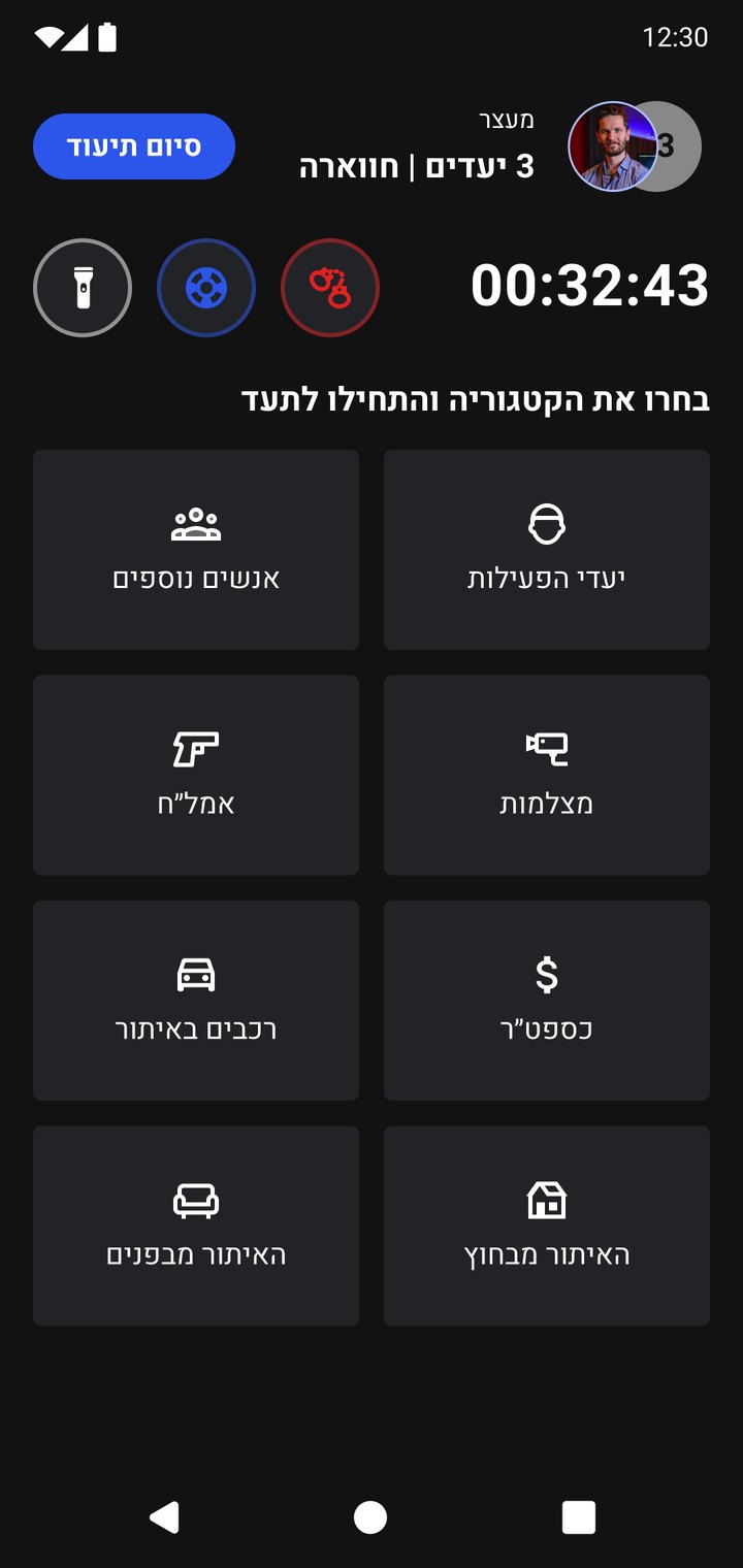
Soldiers log everything they encounter during an activity: weapons, suspicious items, people, vehicles, signs of incitement. Every entry feeds the intelligence database commanders use to plan what comes next. Two problems pulled against each other:
The database was getting messy. Duplicates, blurry shots and wrong categories made it hard to trust and search.
There was no time to slow down. Activities are short and risky, and it looked like fast documentation was what created the mess.
The feature had to catch mistakes as they happen without making documentation slower.
Where it starts
The noise shows up when the next activity is built.
Ops and intel officers build each new activity, on the web or on the phone. Part of it is adding photos from past activities and aerial photos of the site to its Aids, the information the team sees before and during the activity. Irrelevant photos made that job slow and error-prone.
So the fix starts in the field: tools that help the soldier get each photo right and file it in the right category from the start.
Constraints
Built during wartime, for users with no time to spare.
The feature was needed urgently during an active wartime period, which compressed the timeline. The soldiers in the core research group were in near-constant operational activity, so research sessions had to be short, focused and scheduled around their reality, not the other way around.
Research
Interviews told me what hurt. Logs told me how much.
INTERVIEWSWhat hurt
Reservists, active-duty soldiers, ops and intel officers.
USABILITY TESTSWhere it broke
The same users, before and after each change.
LOG ANALYSISHow much
Used fields, skipped fields, reused old photos.
#1 COMPLAINT
Scrolling through piles of irrelevant photos while planning an activity.
GAP FOUND
No category for a person with no ID on them.
Insight
Speed didn't create the noise. Missing structure did.
It looked like fast documentation was the cause of the mess. The research showed otherwise: soldiers skipped a long form, and filed items under the wrong category because the right one didn't exist. So a better structure could be both faster and cleaner, and that is what the 90 to 60 seconds and the cleaner database both came from.
Designed for the field
Soldiers document while exposed, often at night, in full gear. That shaped the interface from day one: dark by default, built for gloves.
No glow
DARK MODE
A bright white screen can give away a soldier's position.
Glove-sized
TOUCH TARGETS
Buttons sized for tactical gloves, not bare fingers.
Stand out
PRIMARY ACTIONS
Continue and Finish documentation always lead, to keep the flow moving.
Bottom sheets
Bottom sheets keep the context on screen.
Pop-ups broke the flow and were slow to dismiss under pressure. Bottom sheets keep the photo and the activity visible, sit within thumb reach, and close with one swipe.
BEFORE // POP-UP
AFTER // BOTTOM SHEET
Categories
Categories that match what soldiers actually find.
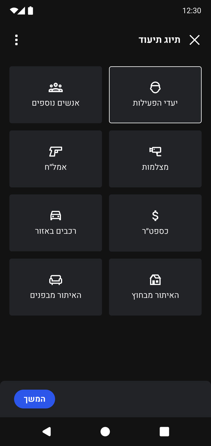
I added categories for the real gaps soldiers raised, such as documenting a person with no ID, so nobody had to force an item into the wrong bucket just to move on. Short tooltips inside the flow replaced separate training, so new or occasional users get an answer without stopping.
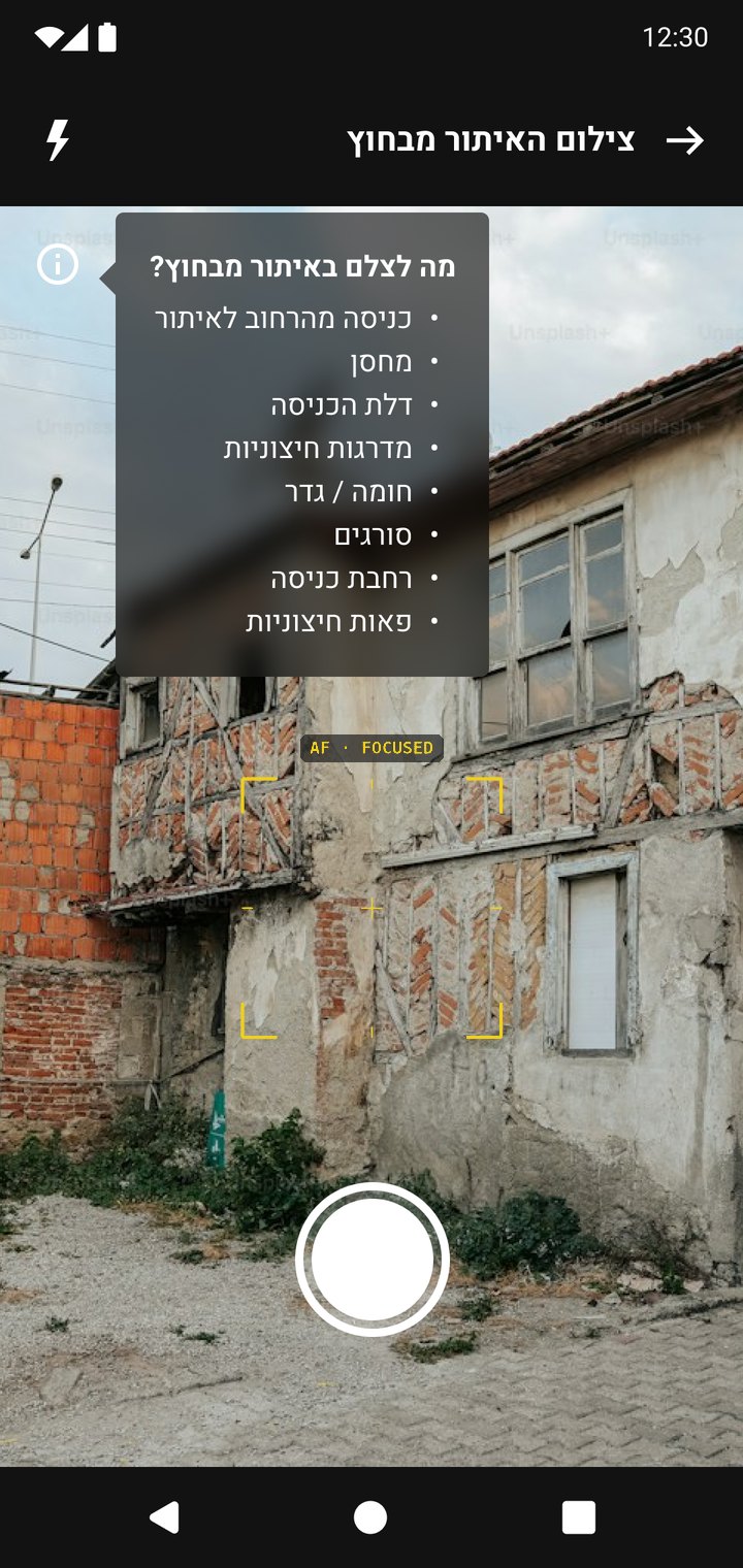
Photographing a site
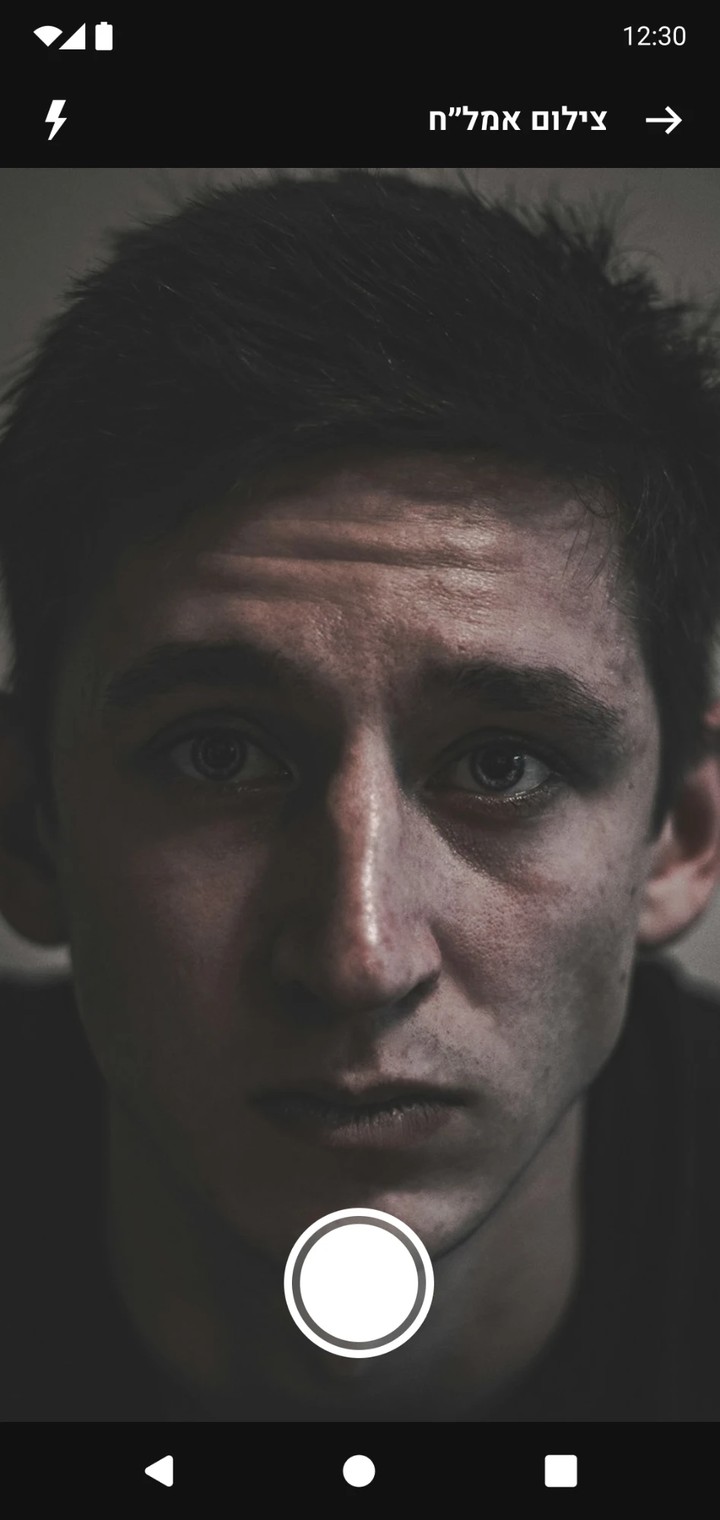
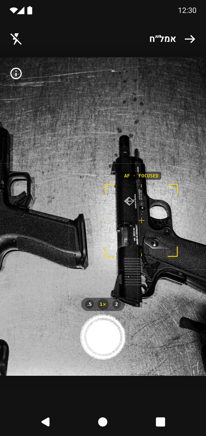
When a soldier starts documenting, the photo has to be precise. It should serve the current mission and the ones after it, and hold up as a source of information and as legal evidence. A short brief inside the camera says what's worth shooting, and autofocus confirms the shot is sharp.
Documenting a person with no ID
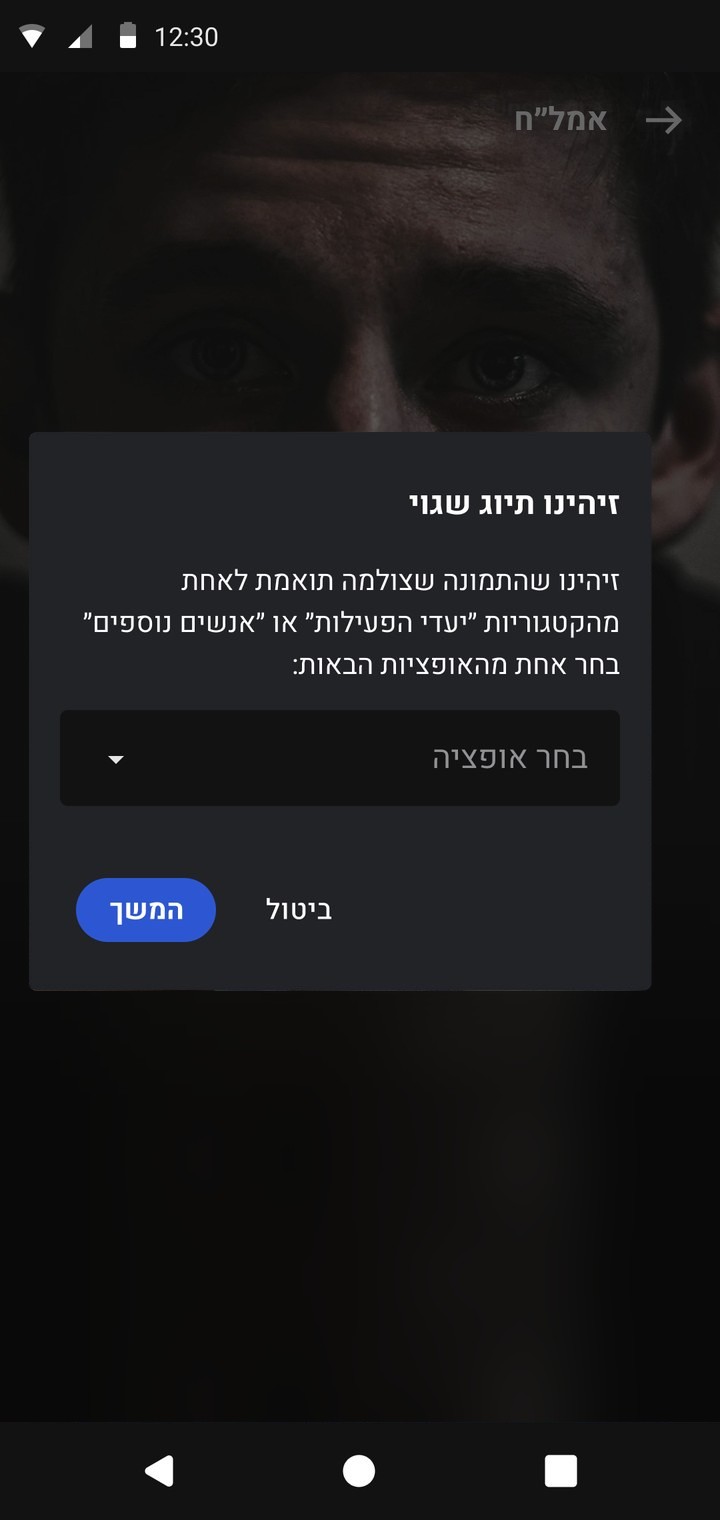
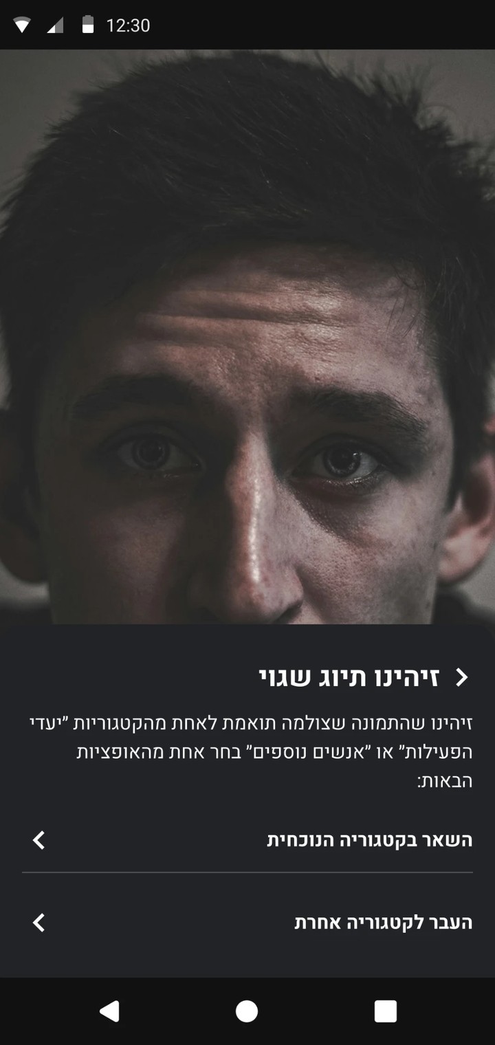
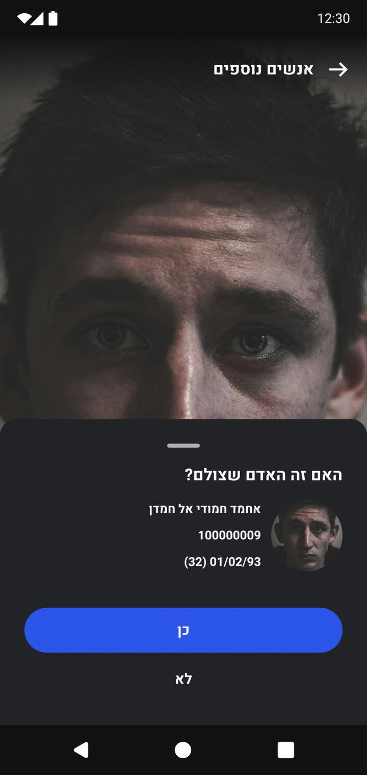
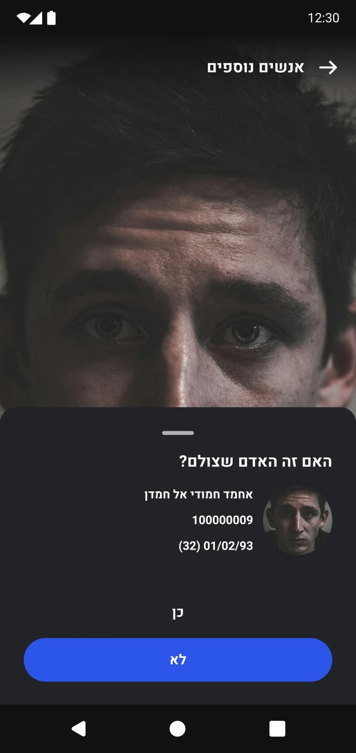
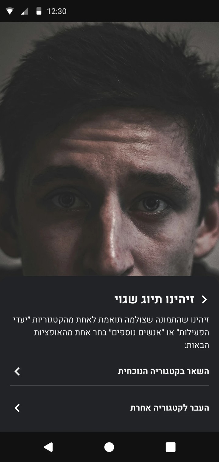
A person without an ID is identified by face recognition, based on AI and the databases we hold. There are two scenarios. In the first, the person is a target: the soldier photographs the face clearly, and the system tells whether they are a target set for this activity or belong under Additional people. In the second, the person is not a target, and the soldier needs to know whether there is a restriction on them, meaning they must be detained, or whether they can go.
Confirm the match
01 / Match
02 / All clear
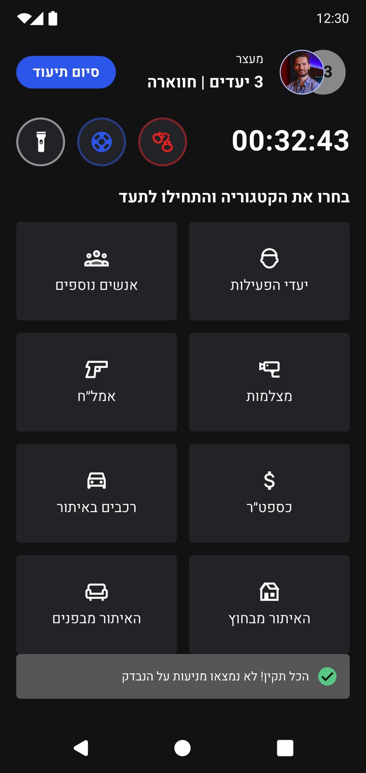
Confirmed, nothing on file. The soldier confirms the match, no restriction comes up, and the flow ends back on Categories with an all-clear toast.
03 / Match
04 / Restriction
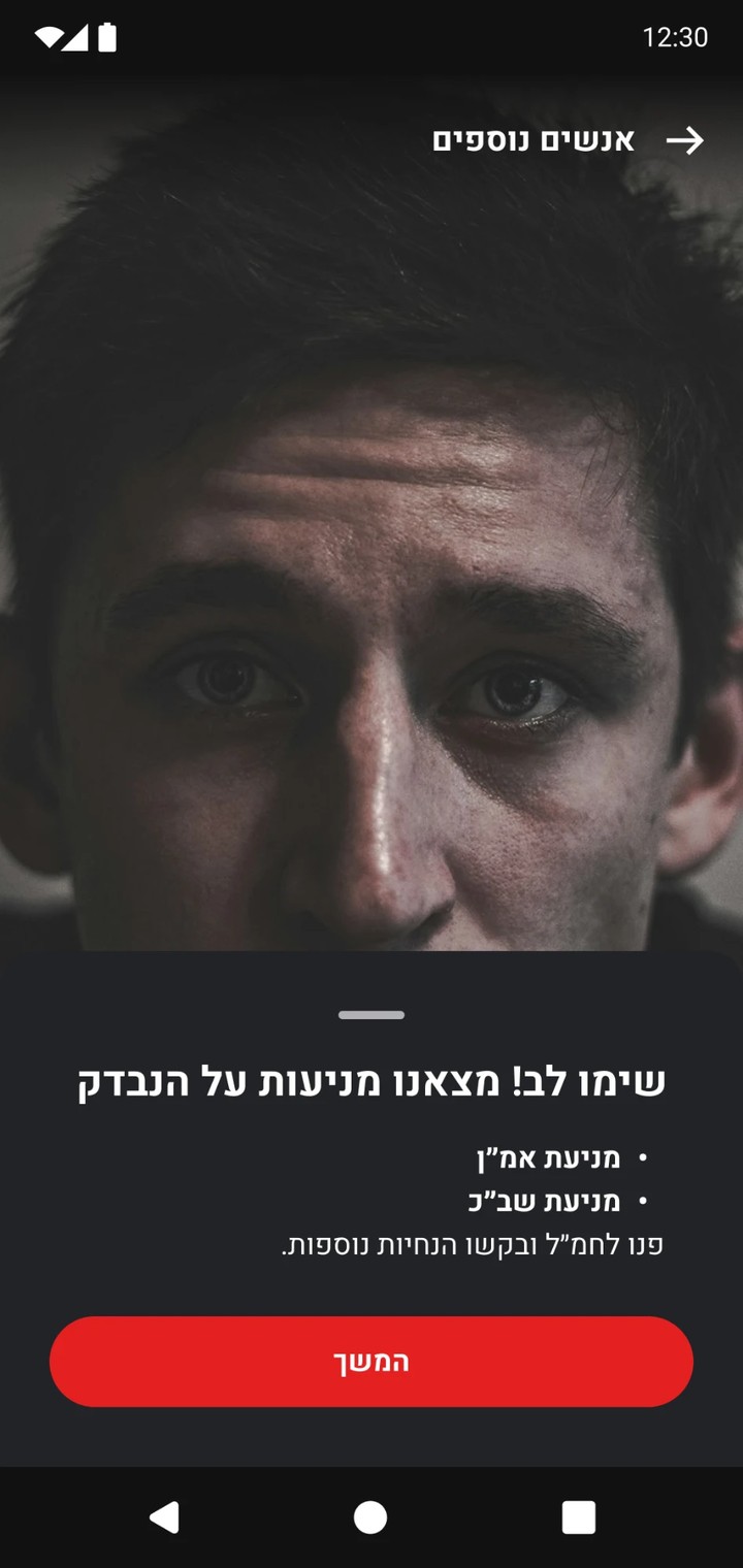
Restriction on file. Same question, but this person has a restriction: it appears right away in red, with an instruction for what to do with them.
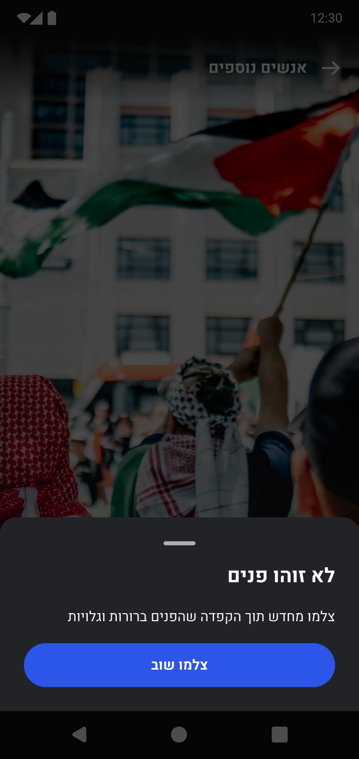
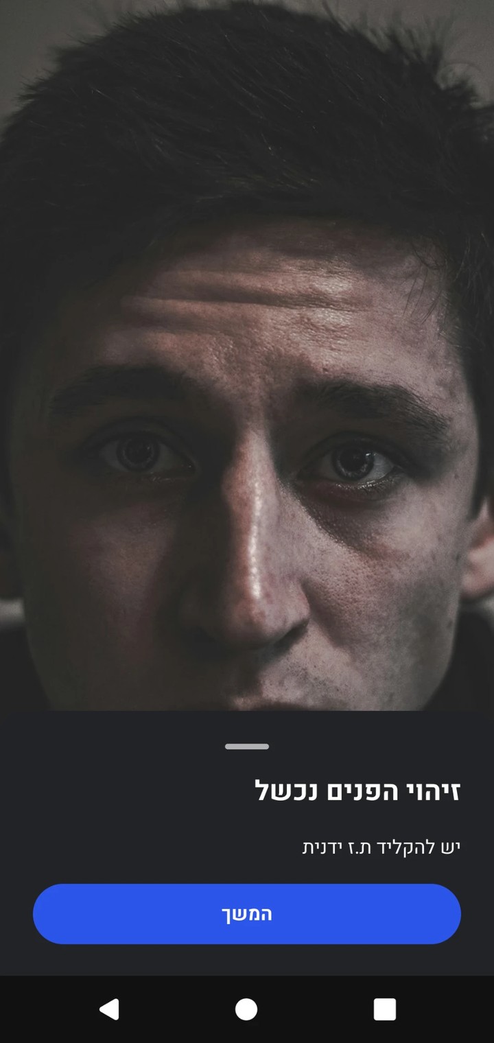
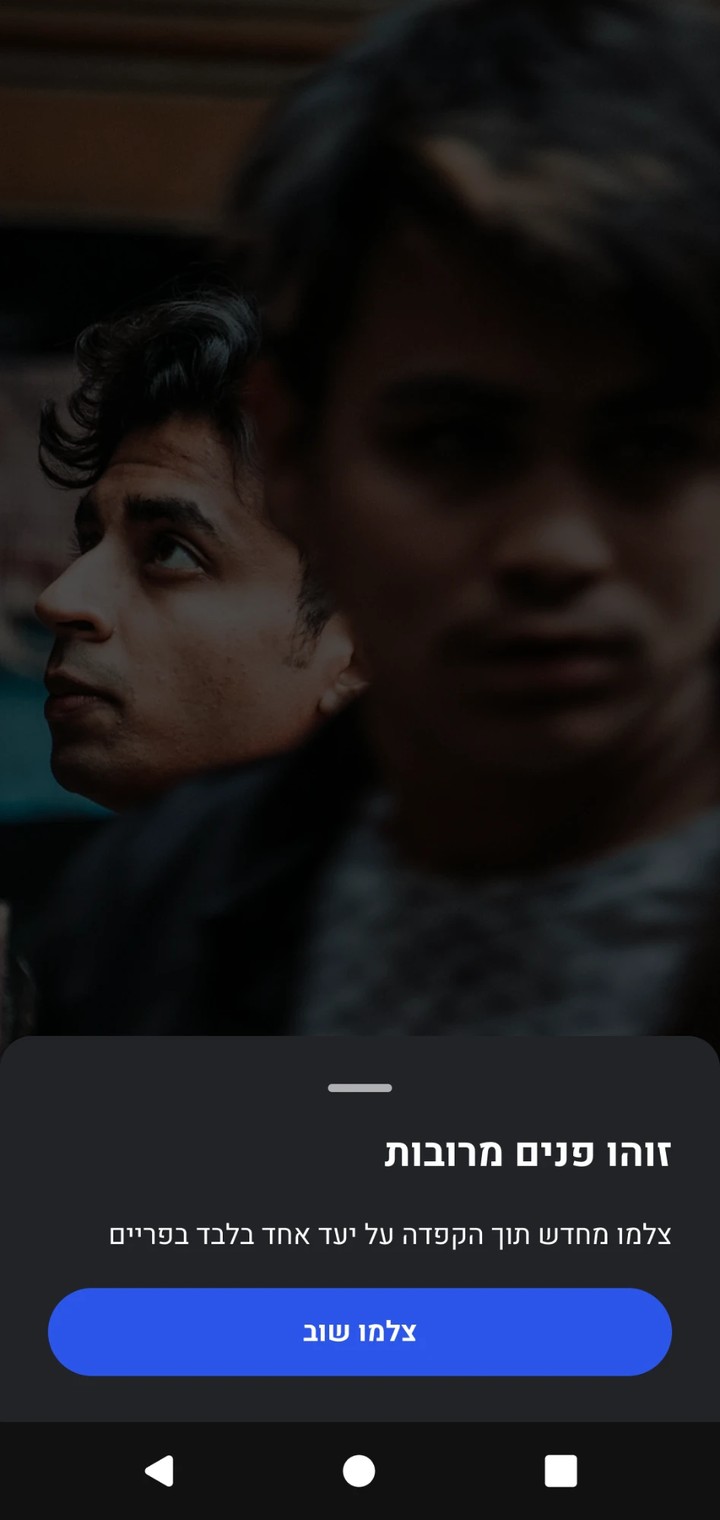
When recognition fails
No face
Two decisions mattered most here. Every response is a bottom sheet, so the photo stays in view and the main action sits under the thumb, which keeps the soldier fast. And whenever recognition fails, the sheet gives an explicit instruction for what to do next instead of a dead end.
Solution
When the AI is unsure, it asks one quick question.
More categories up front, but every single entry stays short:
01
Pick & shoot
Choose a category and take a photo.
02
AI classifies
Matched against what's already in the database.
03
Confident
Filed automatically. Only quantity, type and an optional note.
04
Not sure
One specific question with a few likely options.
05
Confirm & next
Until the whole activity is documented.
Instead of a wrong guess quietly landing in the database, the system catches its own uncertainty in the moment and protects the data without slowing anyone down.
Documenting a weapon
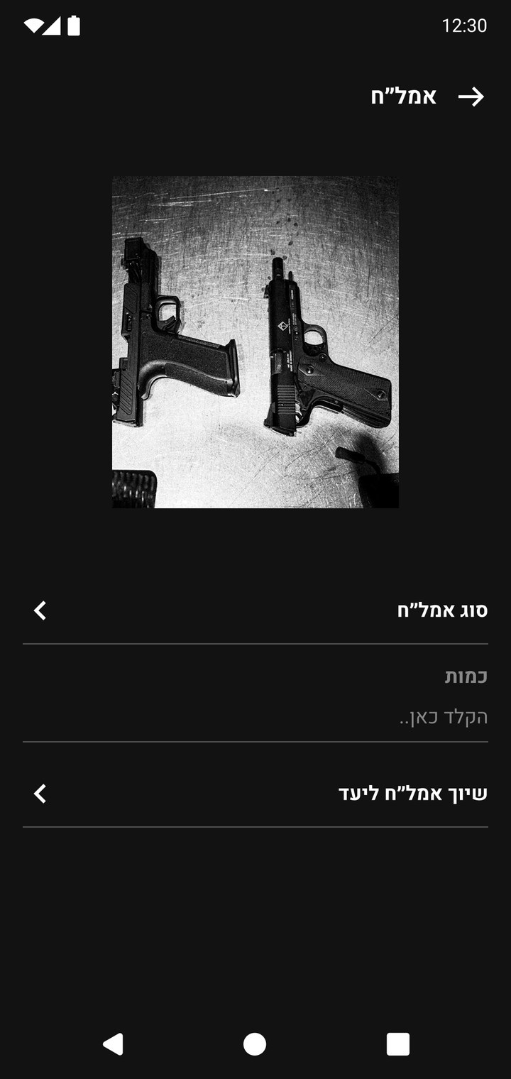
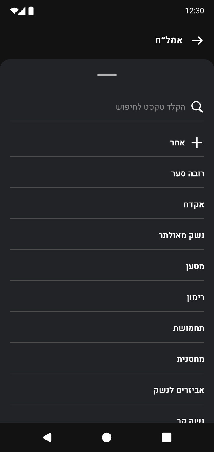
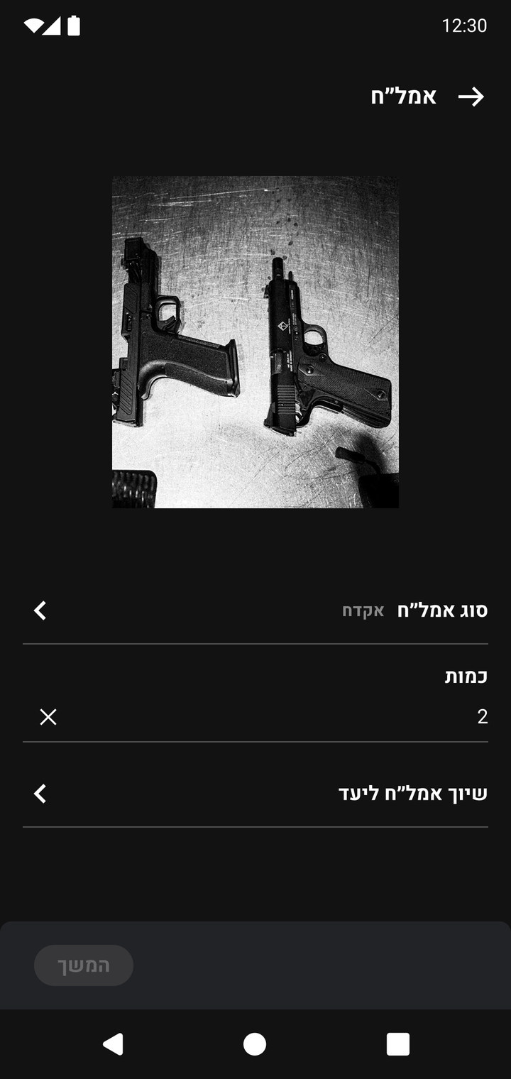
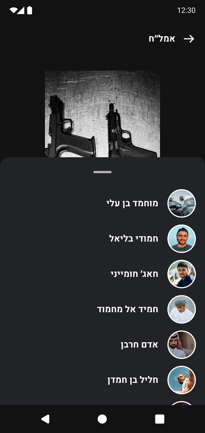
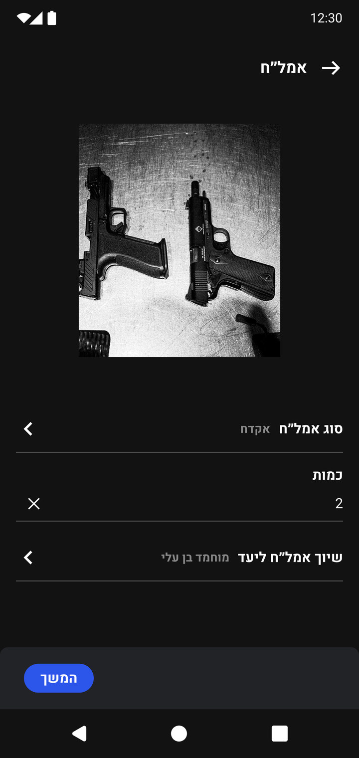
When the photo matches the category, the flow stays short. The soldier shoots, confirms, and fills three fields. Each field opens a bottom sheet instead of a new screen, so the photo stays visible the whole time.
01Choose a categoryEvery action starts on the main screen.
02ShootThe camera opens inside Weapons and focuses on the object.
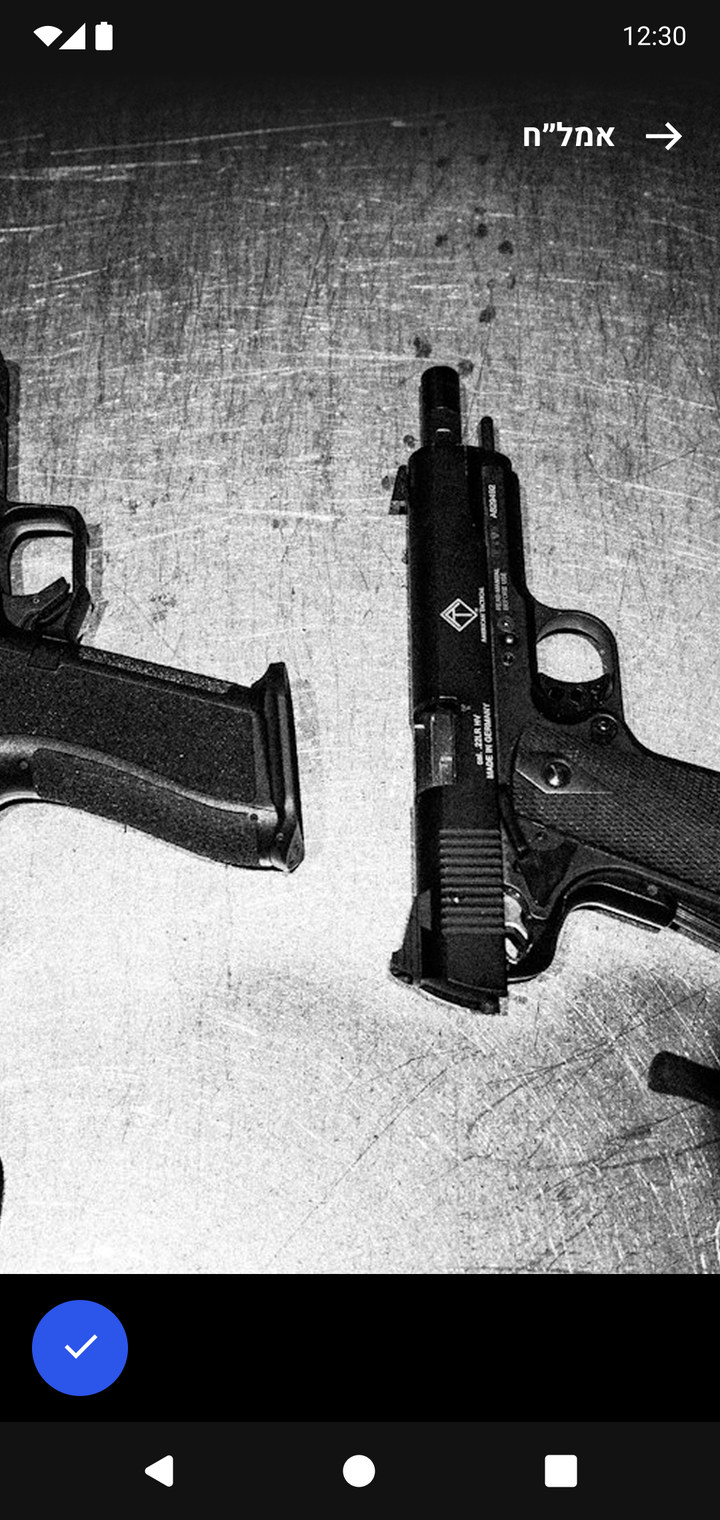
03Approve the photoOne tap confirms the shot.
04Three fieldsType, quantity and the target it belongs to.
05Pick a typeA searchable sheet, with "Other" for anything new.
06Add a quantityContinue stays disabled until every field is filled.
07Assign to a targetChoose from the activity's targets, by face and name.
08ReadyContinue turns on. The item is documented.
Collaboration
An interface as honest as the model behind it.
I owned UX/UI end to end and worked closely with the machine learning and computer vision teams to understand how the model worked, what it learned from, how it made decisions and where its limits were. That let me design an interface that never looked more certain than the AI actually was.
Validation
Real usage logs measured the change.
Photo quality improved about 20% in the first month, and reached roughly 40% as the AI and the flow matured. Here, quality means fewer junk photos and more relevant ones that give soldiers precise information instead of a vague picture. The new categories screen, with more options than before, and the shorter, more selective flow both drove it. We didn't measure relevance directly; photo quality was our proxy.
Documentation time dropped from about 90 seconds to about 60 seconds per item, saving 30 seconds on each one by cutting the long form soldiers used to fill in, across many items per activity.
The AI learned to recognize object types that weren't in the database before, so the database grew richer, not just cleaner.
Outcome
Soldiers trusted it because it stayed out of the way.
The right move was often to do less: fewer required fields, fewer taps, controls that work with gloves, guidance in the moment instead of training. The classification worked because it was silent when confident and asked for help only when it truly needed it. That's why soldiers treated it as a tool, not one more obstacle.
One bottom sheet, re-themed for each product by tokens alone. Switch the product to see it.
Problem
Three products, three versions of every button.
Two designers were responsible for three operational products. Each had its own development team, its own users and its own context: some screens are used on a phone in the field, others on a large screen in a control room.
Over time every product had grown its own buttons, inputs, colors and patterns. The same questions were answered again and again: what does a primary button look like here, how does an input show an error, which gray is the secondary text?
Constraints
One system for the field and the control room.
Different contexts. Two products are dark, mobile-first and used on the move. The third is a light web system for managing data in large tables.
Different teams. Each development team kept its own version of the UI, so a fix in one product never reached the others.
One family. Users move between the products, so they had to share the same patterns, behavior and language.
Insight
The goal: design a component once, and let it adapt to every product, platform and theme without being redrawn.
Redrawing a component per product was what created the drift in the first place. The fix was structural: components that never hold a raw color or size, only a reference to a token that each product fills in its own way.
Priorities
Start where most screens live.
We began with the foundations: colors, typography and buttons. From there we moved to inputs and bottom sheets, which together covered about three quarters of the main screens in the products. Everything else was built on top of that base.
TokensMY PART
One core, three themes
I built the token structure in Figma variables in three layers. Components never use raw colors. They point to semantic tokens, and each product maps those tokens to its own palette. The same tokens live in code too: the developers built their own design system library on top of them.
1. Primitives
Shared palettes with ten steps each, plus alert colors for error, success and warning.
↓ mapped to
2. Semantic tokens per product
The same token names in every product, with different values. A component asks for Brand/Primary and gets the right color wherever it lives.
Product A
Brand/Primary
Brand/Secondary
Background/Main
Background/Secondary
Text/Main
Product B
Brand/Primary
Brand/Secondary
Background/Main
Background/Secondary
Text/Main
Product C
Brand/Primary
Brand/Secondary
Background/Main
Background/Secondary
Text/Main
↓ used by
3. Components and platform modes
Components consume semantic tokens only. A separate text collection has Web and Mobile modes, so the same component switches its type scale by platform.
Token
Web
Mobile
Font/Size/3XL
24
20
Font/Size/2XL
20
18
Font/Size/L
16
14
Font/Size/M
14
12
Font/Size/S
12
10
Adding a new product or theme means mapping one set of semantic tokens. No component has to be touched.
ButtonsMY PART
One component, every scenario
For every component I owned, I followed the same process:
AuditCollect every version of the component across the three products, on web and mobile.
Define the anatomyAgree on the parts, properties and states, and what each one is for.
Build it onceOne component set with variants and properties, connected to tokens instead of fixed colors.
Test it in contextDrop it into real screens of all three products, in light and dark, and fix what breaks.
Document and hand offWrite the usage rules and share them with all three development teams.
The button
The primary button set grew to 79 variants. In practice a designer or developer answers four questions: which product, which size, which type and which state. Try it:
Save changes
Product A / L / Primary / Default
PRODUCT
SIZE
TYPE
STATE
Two rules kept the set small enough to use. Hover and pressed states are derived from the brand color instead of picked by hand, so they work in any product. Success and destructive colors come from the shared alert tokens, so "delete" looks the same everywhere.
InputsMY PART
The input
Inputs carry more of the work in these products: forms are long and often filled in on the move. Instead of a separate component for every case, I built one input with properties that switch on and off.
Field typeDefault, leading text, leading dropdown, trailing dropdown, payment
StatePlaceholder, focused, filled, disabled
IconsOptional left and right icon slots, each swappable
LabelsHeadline and secondary headline, on or off
DestructiveOne switch for the error look and helper text
ModeLight or dark, driven by the product theme
+972Search a location
Start typing to see suggestions
PRODUCT
STATE
FIELD TYPE
DESTRUCTIVE
Pop-upsMY PART
Pop-ups and bottom sheets
Most forms in the mobile products live inside a pop-up or a bottom sheet. I built them from the same parts as everything else: the surface comes from the background tokens, the fields are the input component, and the actions are the button component.
That meant a sheet never needed its own colors or its own button styles. The sheet at the top of this page is one of them, re-themed for each product without being redrawn.
Typography & colorMY PART
Typography
All three products use Heebo, chosen for its clear Hebrew and Latin letterforms and readable figures. The products are right-to-left, so every component was built and tested for RTL first.
Style
Mobile
Web
Weight
Large title
20
24
Bold
Medium title
18
20
Bold
Small title
16
16
Bold
Body and buttons
14
14
Regular, Medium
Caption and tags
12
12
Regular
Color and contrast
Every text color was checked against its background, with contrast ratios documented next to each swatch. Alert colors are shared across products, so a status always means the same thing.
Error#E42020
Success#1CBB69
Warning#F0A753
FoundationsTOGETHER
Foundations
Under the components sit the foundations every product shares: color with dark mode and contrast checks, iconography in five sizes, selection controls, elevation and blur.
Light, Product C
Off
On
Mixed
Disabled
Checkbox
Radio
–
Toggle
–
Dark, Product A
Off
On
Mixed
Disabled
Checkbox
Radio
–
Toggle
–
Checkbox, radio and toggle share one set of states across all three products, in light and dark: one component instead of three.
Light, Product C
Side: the element lifts, offset grows
XS0 / 8
S2 / 8
M4 / 8
L6 / 8
XL8 / 8
2XL10 / 8
Front: the element floats, blur grows
XS0 / 4
S0 / 8
M0 / 12
L0 / 16
XL0 / 20
2XL0 / 24
Values are offset / blur in px, black at 25% opacity.
Dark, Product A
Side: the element lifts, offset grows
XS0 / 8
S2 / 8
M4 / 8
L6 / 8
XL8 / 8
2XL10 / 8
Front: the element floats, blur grows
XS0 / 4
S0 / 8
M0 / 12
L0 / 16
XL0 / 20
2XL0 / 24
Values are offset / blur in px. On dark surfaces the shadow turns into a soft white glow at 18%, so depth still reads.
Elevation from XS to 2XL, in light and dark, so depth is picked from a list instead of invented per screen.
DevelopersTOGETHER
Working with developers
A design system only works if the people building the products use it. With two designers for three teams, we had to make the library easy to find, easy to read and easy to trust.
Building it was a joint decision with the developers. Their plan put one developer from each team on the design system, so day-to-day work never stopped, and every sprint we could bring screens built before the system up to date.
Foundations
Colors and dark mode
Typography
Icons
Shadow and blur
Logos
Components
Buttons and button groups
Inputs and fields
Dropdowns and toggles
Badges, tags, tooltips
Pop-ups and bottom sheets
Patterns
Dashboards
Tables
Map cards
Navigation and menus
Search and filters
Platform
Status bars
Android navigation
Keyboards
Loaders and progress
One library, one source of truth. All three teams worked from the same file, organized from foundations to components to patterns.
Names that match the code. The tokens live both in Figma and in the developers' own design system library, with the same names, so every value maps one to one.
Shared documentation. A decision made with one team reached the other two.
Two designers, one voice. We split ownership by component, reviewed each other's work and agreed on rules before building.
A clear path for new components. Ariel and I decided together what to add, prioritized by each product and its features. Updates shipped with the monthly release, and the dev team lead and product manager knew exactly where to fit the work in every sprint.
Outcome
Three products, one design language, half the build time.
Every screen in all three products now runs on the same system, and a new screen takes about half the development time it used to:
100% of screens migrated. Every existing screen in all three products was brought onto the system.
Development time cut in half. Teams build new screens from ready components instead of recreating them.
One fix reaches every product. A change to a token or component updates all three products at once.
Faster UI onboarding. New developers got up to speed on the UI quickly.
The cost: a year to build the foundation, then a steady day and a half of our week to maintain it, a year and a half in total to cover every screen.
What I learned
Structure beats screens. The token layers did more for consistency than any single screen.
Start from the hardest case. Designing a component for its most demanding scenario first made the simple cases come for free.
A system is a service. Documentation and conversations with developers mattered as much as the components.

 Shoot
 Approve the photo
 Three fields
 Pick a type
 Add a quantity
 Assign to a target
 Ready